Tidy Tuesday
This is my very first Tidy Tuesday post where I analyze a data set that I have never seen before. The astute may notice this blog date is very much not NOT a Tuesday. Instead, the name comes from the weekly Tidy Tuesday(https://github.com/rfordatascience ## French Train Schedules
I chose a data set from the past containing French train line schedules, along with accompanied statistics aggregated at the monthly level. Data can easily be downloaded using the tidytuesdayR package. This data set has a particular field missing for more recent years and requires some data cleaning steps.
tt <- tidytuesdayR::tt_load('2019-02-26')##
## Downloading file 1 of 3: `full_trains.csv`
## Downloading file 2 of 3: `regularite-mensuelle-tgv-aqst.csv`
## Downloading file 3 of 3: `small_trains.csv`trains <- tt$full_trains %>%
mutate(date = lubridate::ymd(paste0(as.character(year),if_else(nchar(month) == 1, paste0("0",month),as.character(month)),"01")),
yearmonth = tsibble::yearmonth(date),
departure_station = str_to_title(departure_station),
arrival_station =str_to_title(arrival_station),
train_leg = paste0(departure_station,"-",arrival_station))
# create a key to join to dataset to pull in correct service
trains_key <- trains %>%
filter(!is.na(service)) %>%
select(train_leg, service) %>%
rename(service_update = service) %>%
distinct()
# Fill in lines that don't have an existing service manually
trains <- trains %>%
left_join(trains_key) %>%
mutate(service = case_when(
!is.na(service_update) ~ service_update,
str_detect(train_leg,"Madrid") ~ "International",
str_detect(train_leg, "Barcelona") ~ "International",
str_detect(train_leg, "Francfort") ~ "International",
str_detect(train_leg, "Stuttgart") ~ "International",
str_detect(train_leg, "Zurich") ~ "International",
str_detect(train_leg, "Geneve") ~ "Internationl",
T ~ "National")) %>%
select(-service_update)Tidyverts
This data set contains monthly statistics for each service, departure station, and arrival station combination. I am going to use the Tidyverts packages to create a tisbble time series object and take a closer look at the total number of trips for each train route.
Creating a Tsibble
Creating a tsibble object requires a key and index variable to be set. The key field contains a unique variable combination for each observation and the index field represents the time component of the series. Earlier I used the tsibble::yearmonth() function to specify that this is a monthly time series. Once in tsibble format, it’s easy to visualize, extract features, or forecast a time series data set with Tidyverts packages.
# tidyverts  --------------------------------------------------------------

library(tsibble)
library(fabletools)
library(feasts)

trains_ts <- trains %>%
  tsibble::tsibble(key = c(service, departure_station, arrival_station), index = yearmonth)

## Viz of all time series
trains_ts %>%
autoplot(total_num_trips) +
  guides(col = FALSE) +
  labs(y = "Trips", x = NULL, title = "Monthly Total Trips by Train Leg",
       subtitle = "Each line represents a unique departure and arrival station combination")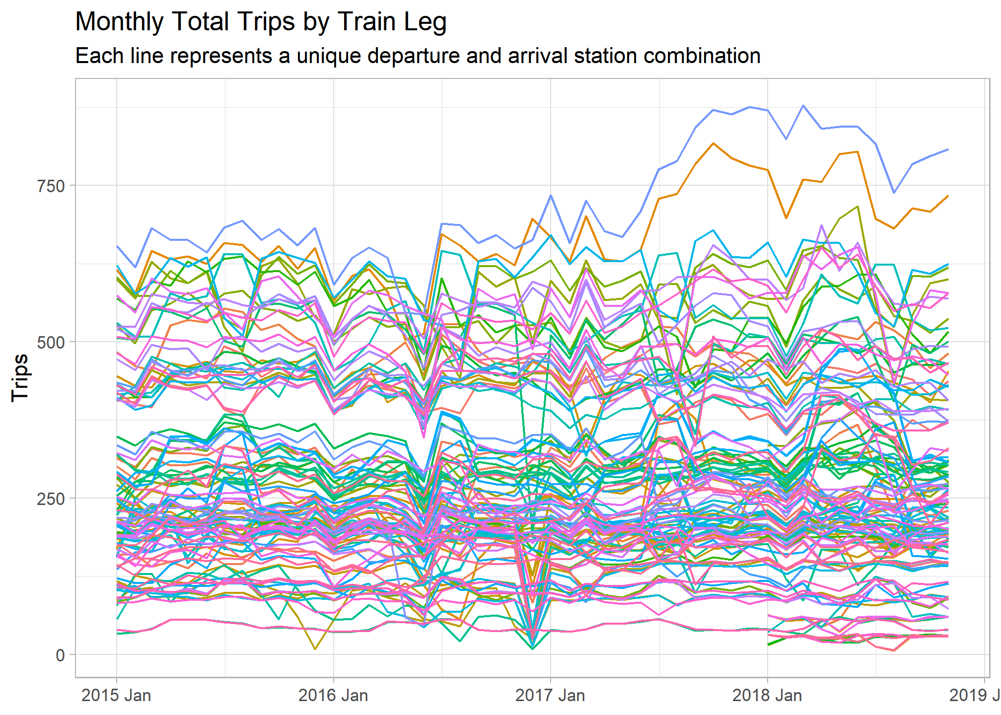
Time Series Feature Extraction
The above graph shows us the time frame of our time series data set and the variation in trip volume among different train routes. Let’s extract some features from these time series in order to better understand differences among them. The fabletools::features() function does just this, transforming the tsibble object into a tibble with one row for each key. I used a set of features pre-defined by the feasts package, but a custom list can be created as well.
note: some features were not appropriate for this data set and had zero variance or NA results. I added an additional processing step to remove these
## Feature Extraction

train_features <- trains_ts %>%
  fabletools::features(total_num_trips, fabletools::feature_set(pkgs = "feasts"))

## Identify columns with NA values and 0 variance
non_zero_var <- train_features %>%
  summarise(across(everything(), ~var(.x, na.rm = T))) %>%
  pivot_longer(cols = everything(), names_to = "column", values_to = "value") %>%
  filter(value != 0 & !is.na(value)) %>%
  pull(column)

## Remove columns with NA values 0 variance
train_features <- train_features %>%
  select(service, departure_station, arrival_station, all_of(non_zero_var)) %>%
  mutate(across(everything(), ~replace_na(.x, 0)))

head(train_features)
## # A tibble: 6 x 42
## service departure_stati~ arrival_station trend_strength spikiness linearity
## <chr> <chr> <chr> <dbl> <dbl> <dbl>
## 1 Intern~ Barcelona Paris Lyon 0.572 1686. 41.0
## 2 Intern~ Francfort Paris Est 0.663 438. 159.
## 3 Intern~ Geneve Paris Lyon 0.205 2137. -41.3
## 4 Intern~ Italie Paris Lyon 0.307 50.7 -3.55
## 5 Intern~ Lausanne Paris Lyon 0.570 147. 81.1
## 6 Intern~ Madrid Marseille St C~ 0.611 1.46 9.32
## # ... with 36 more variables: curvature <dbl>, stl_e_acf1 <dbl>,
## # stl_e_acf10 <dbl>, seasonal_strength_year <dbl>, seasonal_peak_year <dbl>,
## # seasonal_trough_year <dbl>, acf1 <dbl>, acf10 <dbl>, diff1_acf1 <dbl>,
## # diff1_acf10 <dbl>, diff2_acf1 <dbl>, diff2_acf10 <dbl>, season_acf1 <dbl>,
## # pacf5 <dbl>, diff1_pacf5 <dbl>, diff2_pacf5 <dbl>, season_pacf <dbl>,
## # nonzero_squared_cv <dbl>, lambda_guerrero <dbl>, nsdiffs <dbl>,
## # bp_stat <dbl>, bp_pvalue <dbl>, lb_stat <dbl>, lb_pvalue <dbl>,
## # var_tiled_var <dbl>, var_tiled_mean <dbl>, shift_level_max <dbl>,
## # shift_level_index <dbl>, shift_var_max <dbl>, shift_var_index <dbl>,
## # shift_kl_max <dbl>, shift_kl_index <dbl>, spectral_entropy <dbl>,
## # n_crossing_points <dbl>, longest_flat_spot <dbl>, stat_arch_lm <dbl>Now that we reduced the time series to a tidy data frame of features, we can work with our original data in a more traditional way. Let’s see which routes have a greatest overall trend strength (increase over the entire time period) and yearly seasonality.
train_features %>%
  mutate(train_leg = paste0(departure_station," to ", arrival_station)) %>%
  ggplot(aes(x = seasonal_strength_year, y = trend_strength)) +
  geom_point() +
  ggrepel::geom_text_repel(aes(label = if_else(seasonal_strength_year >= .87 | trend_strength >= .8, train_leg, NULL))) +
  labs(x = "Yearly Seasonal Strength", y = "Overall Trend Strength",
       title = "Trend vs Seasonality for All Train Legs",
       subtitle = "Higher values labelled for context")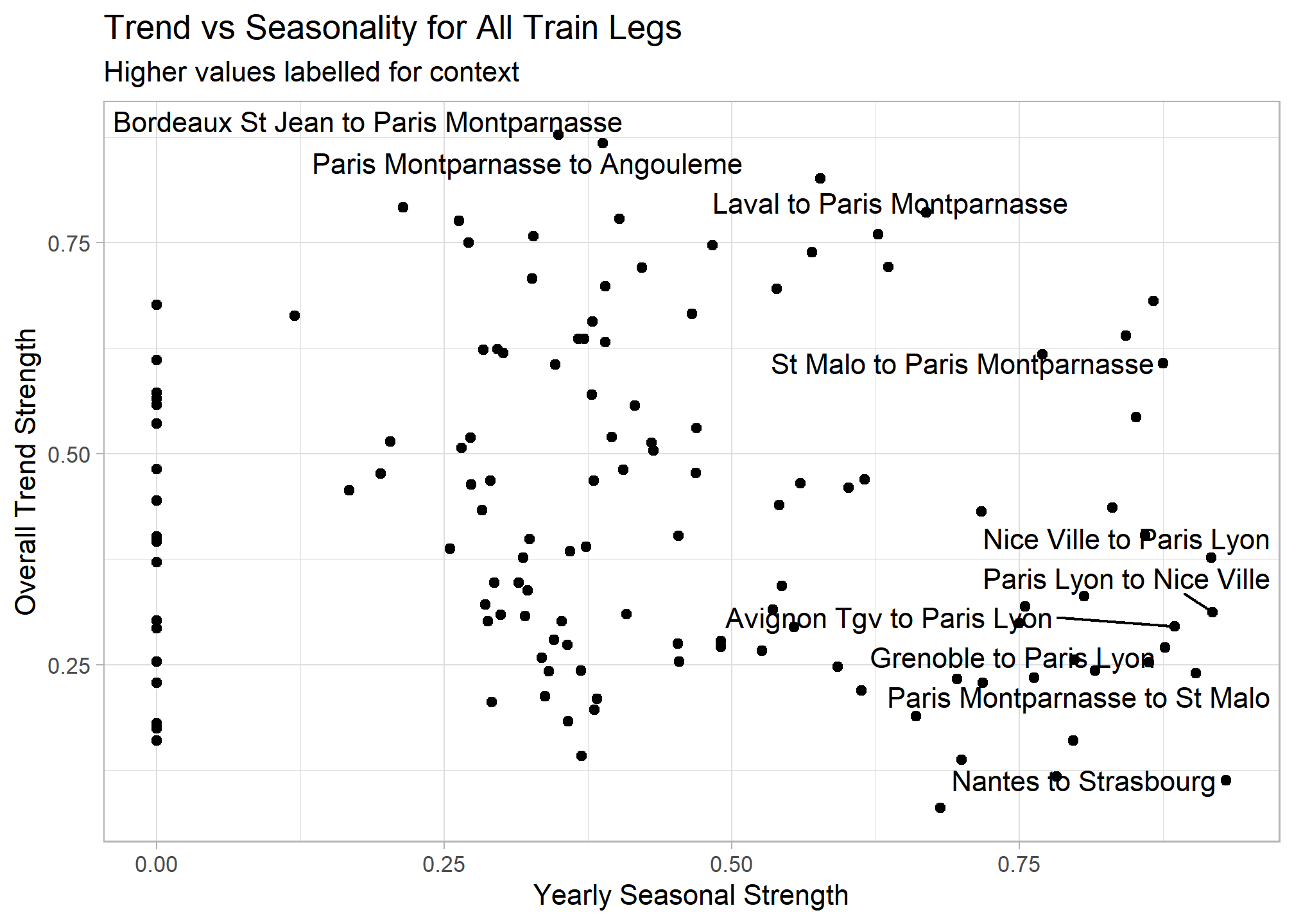
Extracting features from the time series lets us easily answer certain questions compared to sifting through hundreds of time series graphs. The below graphs use simple filtering to answer questions I had about the data set.
## Most positive trend

trains_ts %>%
  inner_join(train_features %>% filter(trend_strength == max(trend_strength)), by = c("service","departure_station","arrival_station")) %>%
  ggplot(aes(x = yearmonth, y = total_num_trips)) +
  geom_line() +
    labs(title = "Which Route Frequency has the Greatest Overall Trend Strength?", y = "Trips", x = NULL) +
  facet_wrap(vars(service, paste0("Departure: ",departure_station), paste0("Arrival: ",arrival_station)))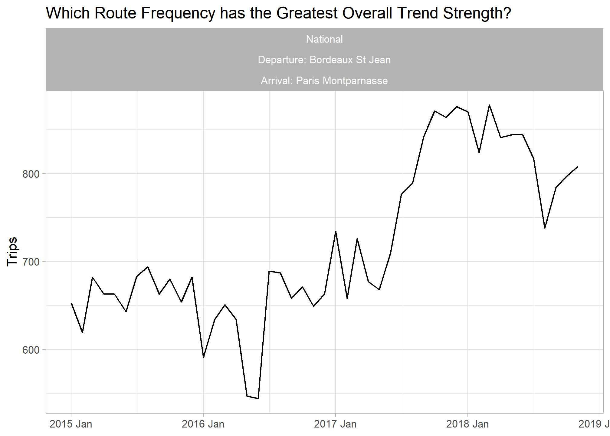
## Most Seasonal Trend

trains_ts %>%
  inner_join(train_features %>% filter(seasonal_strength_year == max(seasonal_strength_year, na.rm = T)), by = c("service","departure_station","arrival_station")) %>%
  ggplot(aes(x = yearmonth, y = total_num_trips)) + geom_line() +
  labs(title = "Which Route has the Most Seasonal Schedule?", y = "Trips", x = NULL) +
  facet_wrap(vars(service, paste0("Departure: ",departure_station), paste0("Arrival: ",arrival_station)))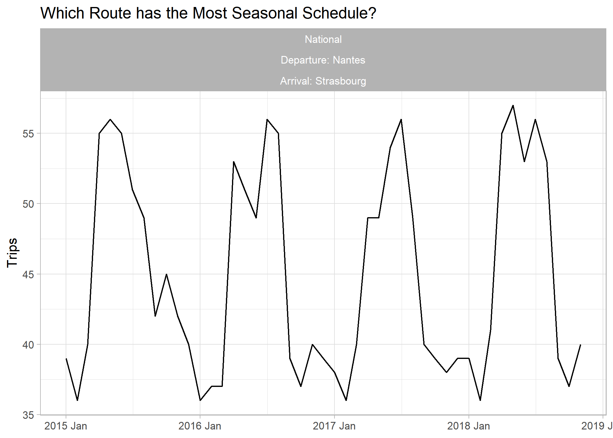
## Highest spikiness

trains_ts %>%
  inner_join(train_features %>% filter(spikiness == max(spikiness, na.rm = T)), by = c("service","departure_station","arrival_station")) %>%
  ggplot(aes(x = yearmonth, y = total_num_trips)) + geom_line() +
  labs(title = "Which Route has the Most Drastic Changes in Volumes?", y = "Trips", x = NULL) +
  facet_wrap(vars(service, paste0("Departure: ",departure_station), paste0("Arrival: ",arrival_station)))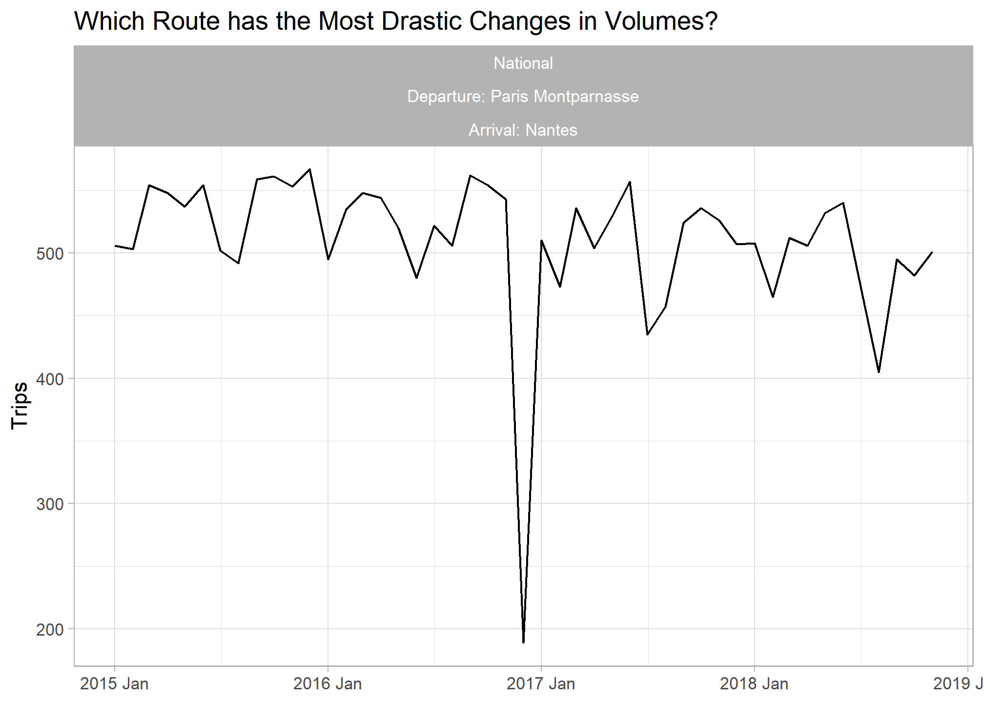
PCA Analysis
Feature extraction lets us expand our exploratory analysis toolkit for time series data. I decided to perform principal component analysis on the train features to better understand the main sources of variation among monthly train volumes.
# Principal Component Analysis on Time Series Features --------------------

features_pcs <- train_features %>%
  select(-service, -departure_station, -arrival_station) %>%
  prcomp(scale = TRUE)


features_pcs$rotation %>%
  as.data.frame() %>%
  rownames_to_column() %>%
  pivot_longer(cols = -rowname, names_to = "PC") %>%
  group_by(PC) %>%
  #top_n(30, abs(value)) %>%
  filter(PC %in% c("PC1","PC2","PC3")) %>%
  mutate(rowname_ro = tidytext::reorder_within(rowname, value, PC)) %>%
  ggplot(aes(x = value, y = rowname_ro, fill = rowname)) +
  geom_col() +
  tidytext::scale_y_reordered() +
  facet_wrap(~PC, scales = "free_y") +
  guides(fill = FALSE) +
  labs(title = "What Features Account for the Top 3 Principal Components?",
        y = NULL)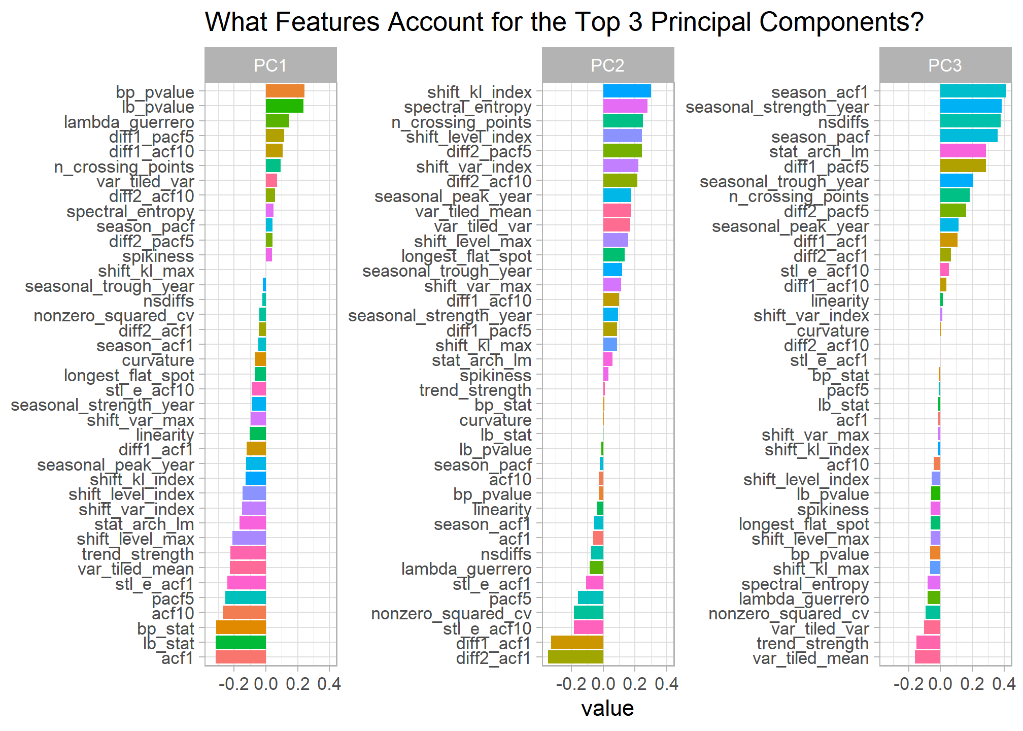
Clustering Analysis
Let’s do the same thing with k-means clustering to group our different train routes and see what characterizes each group. Below I perform a traditional k-means clustering analysis, look at the main differences between each cluster, and join the cluster number back to the train features and our original data set.
# K means clustering ------------------------------------------------------

set.seed(456)

## Scale train features
train_features_scaled <- train_features %>%
  mutate(across(where(is.numeric), ~scale(.x)))

## Cluster and store results for K 1 through 9
train_cluster <- tibble(k = 1:9) %>%
  mutate(
    kclust = map(k, ~kmeans(train_features_scaled %>% select(where(is.numeric)), .x)),
    tidied = map(kclust, tidy),
    glanced = map(kclust, glance),
    augmented = map(kclust, augment, train_features_scaled %>% select(where(is.numeric)))
    )

## Visualize results to detemine optimal clusters to use
train_cluster %>%
  unnest(cols = c(glanced)) %>%
  ggplot(aes(k, tot.withinss)) +
  geom_line() +
  geom_point() +
  scale_x_continuous(breaks = seq(1,9,1)) +
  labs(title = "Elbow Analysis of Train Route Feature Clusters",
       subtitle = "Suggests 4 is the optimal number of clusters")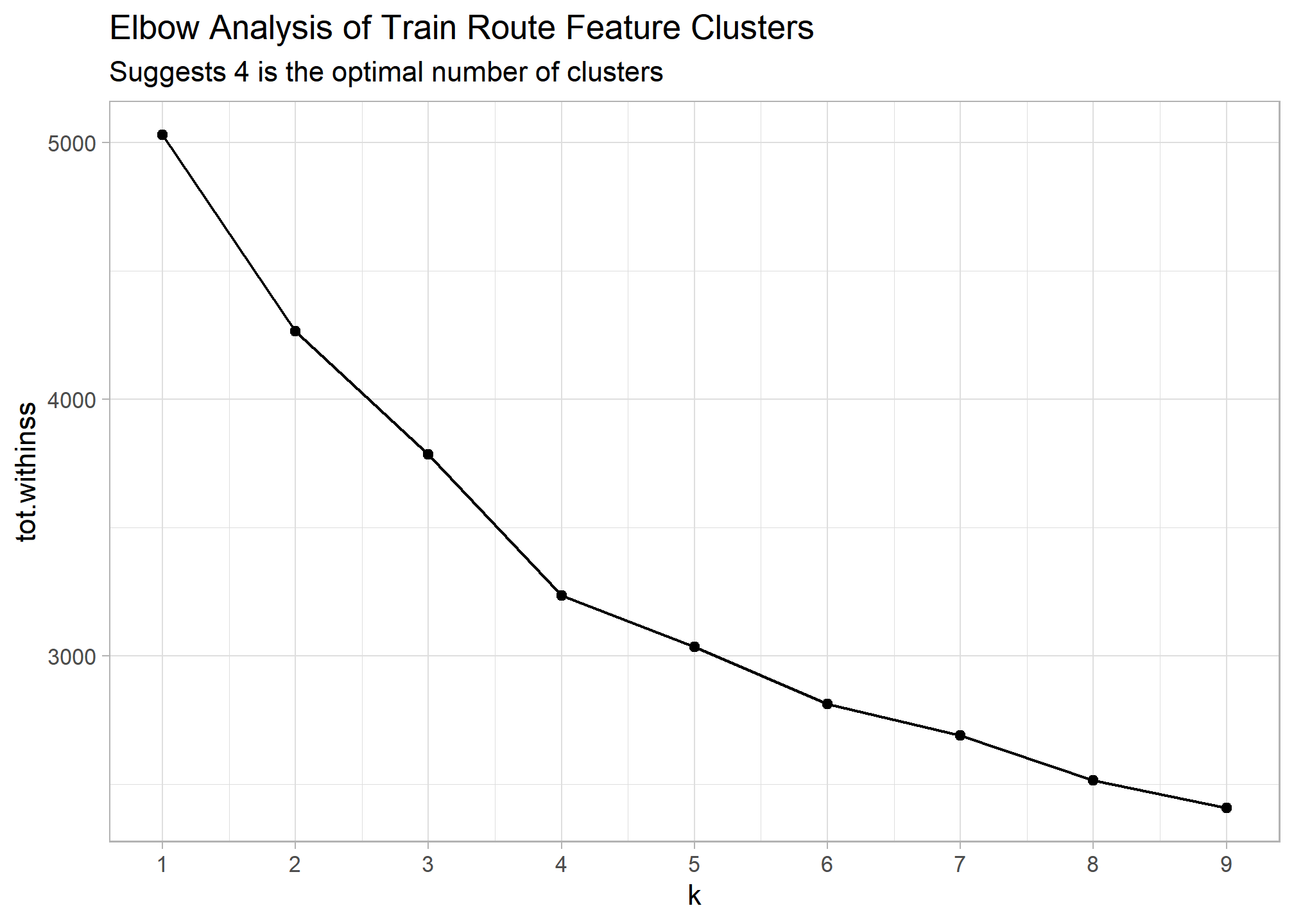
## Add cluster column to train features
train_features_clusters <- train_features %>%
  mutate(cluster = train_cluster %>%
           filter(k == 4) %>%
           unnest(augmented) %>%
           pull(.cluster))
If we facet our original time series graph by cluster number we can begin to see the main differences between our groupings. There looks to be a set of new train lines that began operating in 2018 that make up an entie cluster.
trains_ts %>%
  left_join(train_features_clusters) %>%
  ggplot(aes(x = yearmonth, y = total_num_trips, col = cluster, group = interaction(service, departure_station, arrival_station))) +
  geom_line() +
  facet_wrap(~cluster) +
  labs(title = "Train Route Volumes Clustered", x = NULL, y = "Total Trips")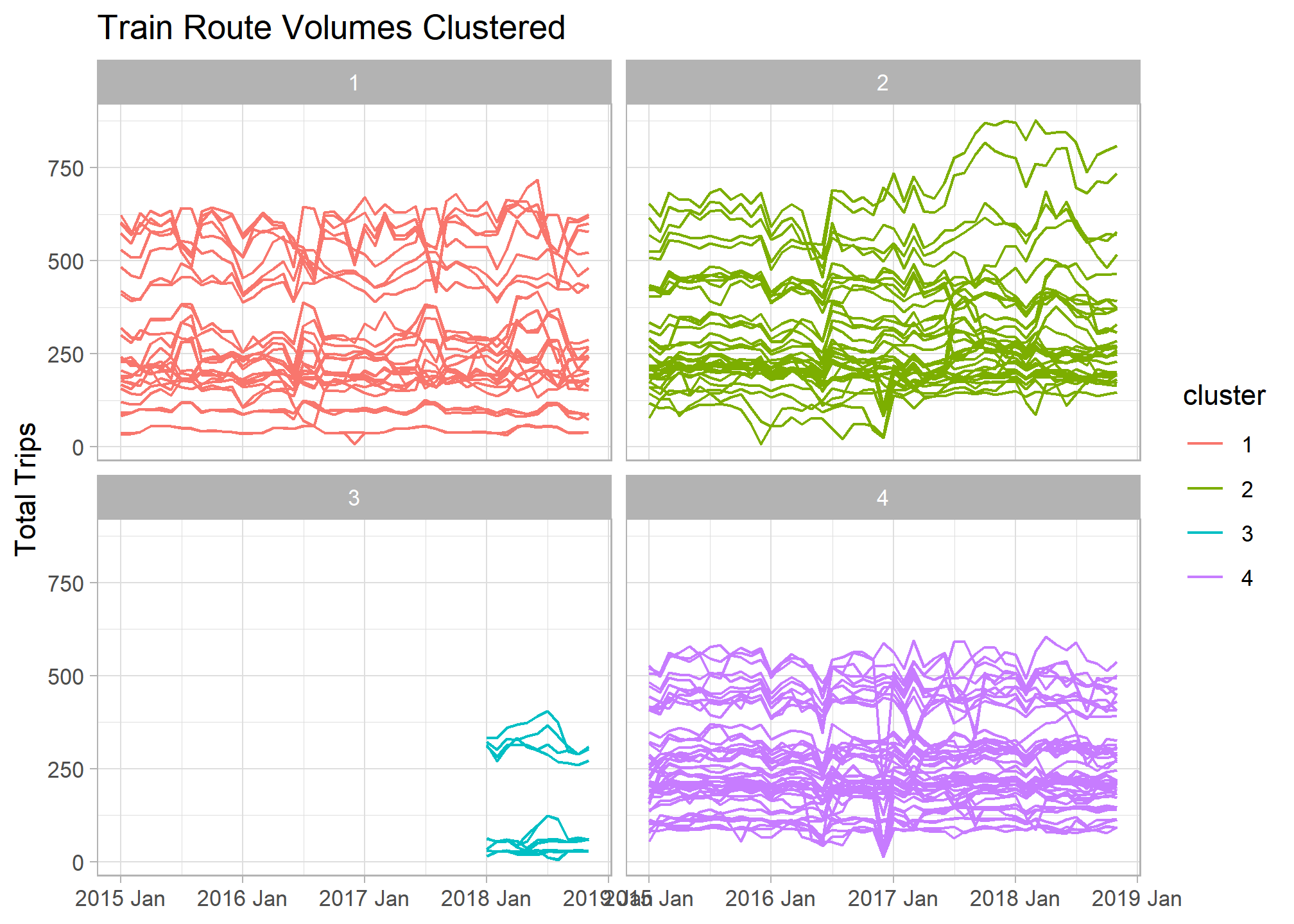
Below are those feature differences between clusters quantified. By graphing a smaller sample of routes from each cluster it’s easier to see the main features represented in the data.
Here are a few of my initial observations:
- Cluster 1 - Most seasonal French train routes. Possibly tied to vacation travel patterns.
- Cluster 2 - Has the highest overall trends. Route volumes tend to steadily increase or decrease over time and with little seasonal pattern.
- Cluster 3 - New train lines that began operating in 2018. Many appear to be international routes.
- Cluster 4 - Flat overall trend with drastic variations indicated by downward spikes. Google searches for some of these spikes coincide with train worker strikes and other service outage events.
## Bar chart of cluster differences
train_cluster %>%
  filter(k == 4) %>%
  unnest(cols = c(tidied)) %>%
  select(-kclust,-glanced, -augmented, -k) %>%
  pivot_longer(cols = trend_strength:stat_arch_lm) %>%
  group_by(cluster) %>%
  top_n(20, abs(value)) %>%
  #mutate(name_ro = tidytext::reorder_within(name, value, cluster)) %>%
  ggplot(aes(x = value, y = name, fill = name)) +
  geom_col() +
  #tidytext::scale_y_reordered() +
  facet_wrap(~cluster, nrow = 1) +
  guides(fill = FALSE) +
  labs(x = "Scaled Value", y = NULL, title = "What Features Define each Cluster?")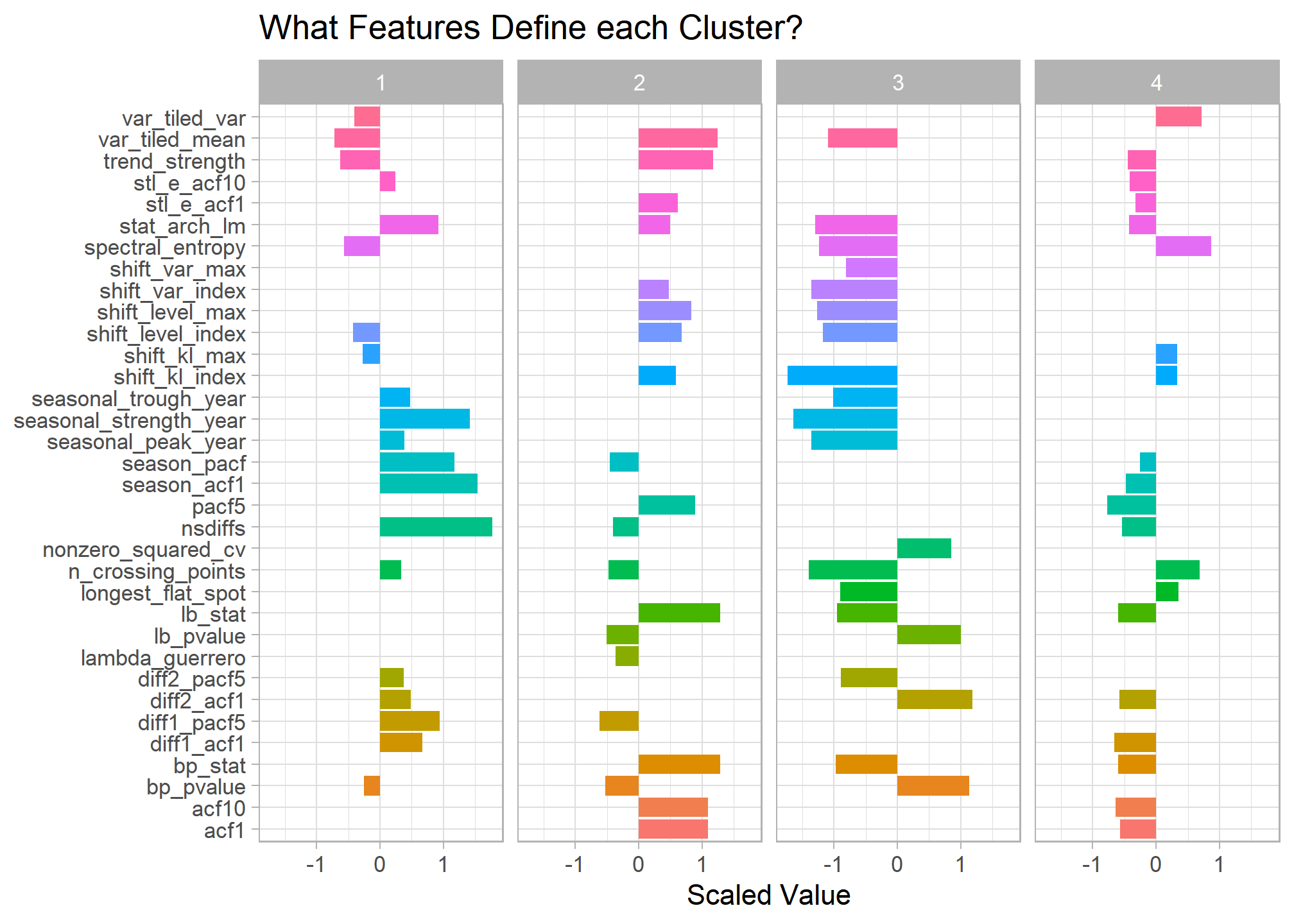
## Sample routes from each cluster
set.seed(1234)

trains_ts %>%
  inner_join(train_features_clusters %>%
               group_by(cluster) %>%
               slice_sample(n = 6)) %>%
  ggplot(aes(x = yearmonth, y = total_num_trips, col = cluster, group = interaction(service, departure_station, arrival_station))) +
  geom_line(size = 1) +
  facet_wrap(~cluster) +
  labs(title = "Train Route Samples by Cluster ", x = NULL, y = "Total Trips")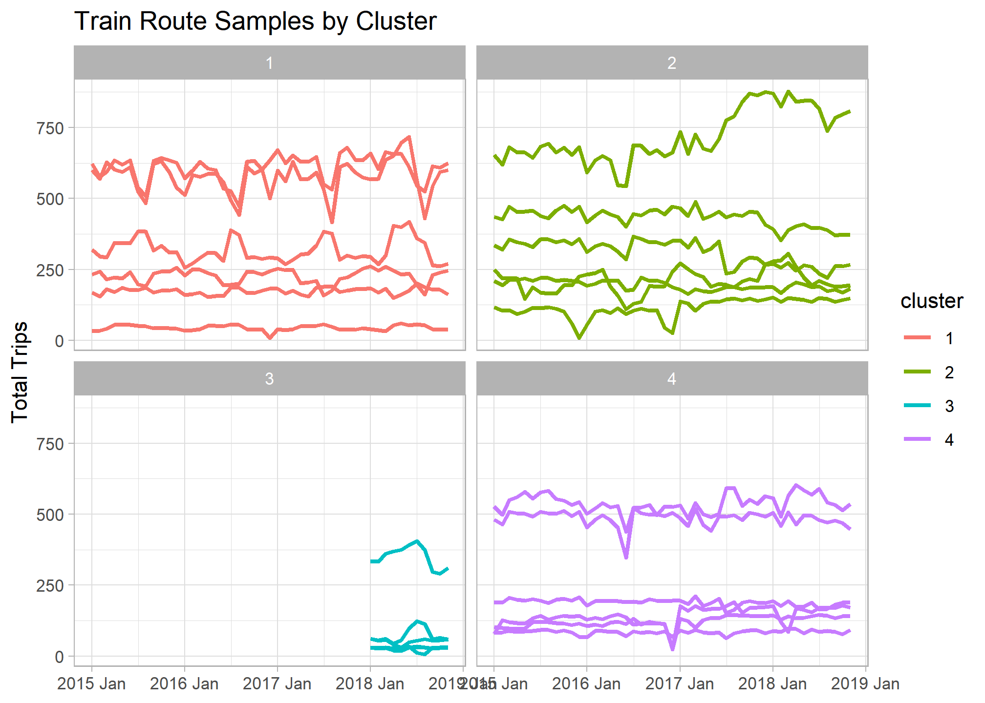
Combining PCA and Clustering
I thought it’d be interesting to compare the PCA and clustering results to see if there are any discrepancies. After combining the results, I created a scatter plot of routes in PC space and colored them by cluster. The results appear very consistent, with the first 2 principal components graph clearly grouping clusters. This also shows that cluster 3 differs most from all others and clusters 4 and 1 appear most alike with overlapping points.
### Combines Graph of PC and Clustering


features_pcs %>%
  broom::augment(train_features) %>%
  left_join(train_features_clusters %>% select(service, departure_station, arrival_station, cluster)) %>%
  ggplot(aes(x=.fittedPC1, y=.fittedPC2, col = cluster)) +
  geom_point(size = 2) +
  theme(aspect.ratio=1) +
  labs(title = " Train Routes in PC Space")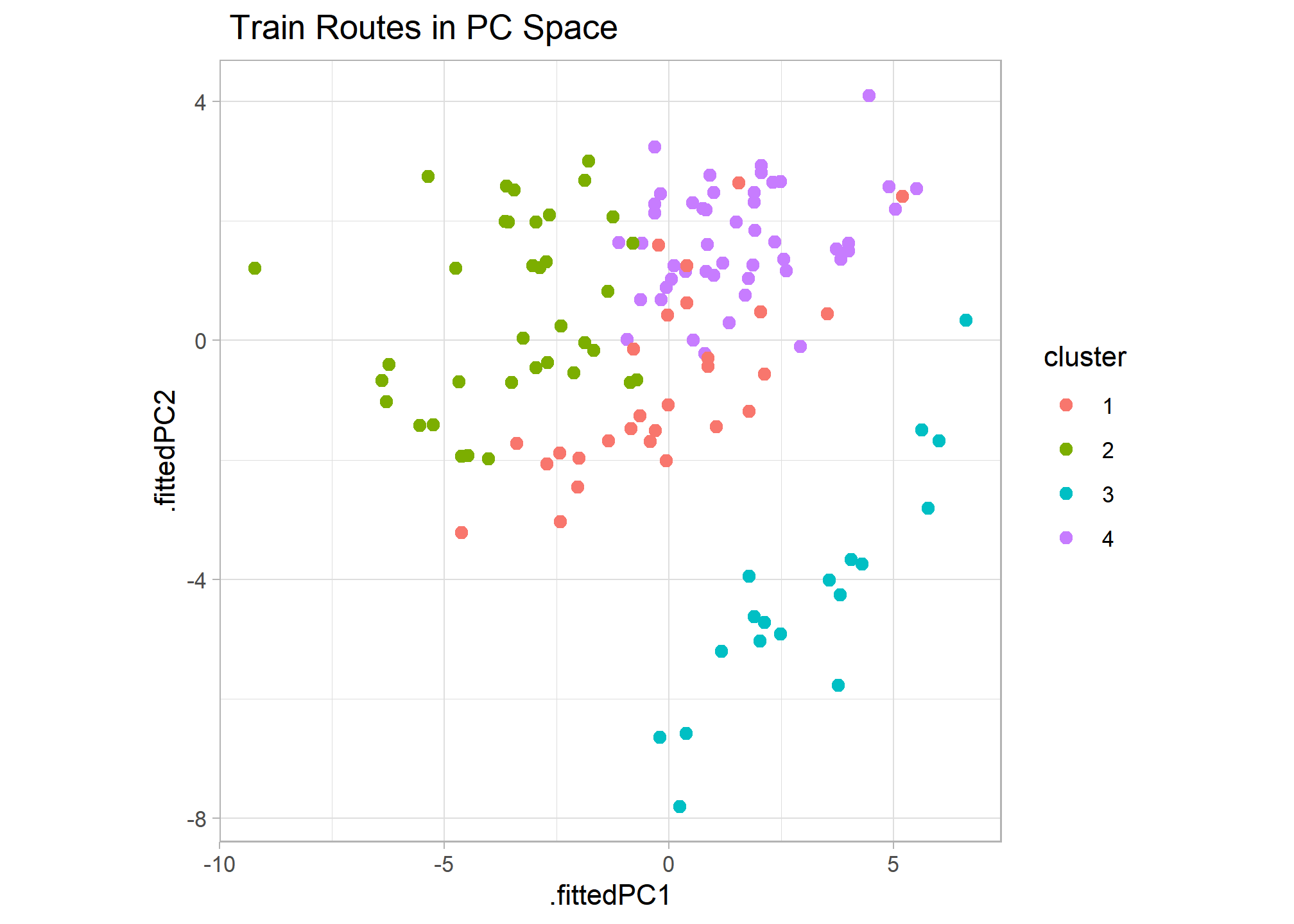
Overview
Above we were able to take a time series data set of 130 French train routes, extract features for each, and perform PCA and clustering analysis to see how route volumes differ most. We saw there were 4 main types of routes based on their monthly total trip patterns with seasonality, overall trend strength, spikiness, and the month a route began operating as the main differentiators.